Uniform illumination is a practical foundation for welcoming, safe, and productive commercial spaces. But why is uniform illumination important in commercial spaces? It helps customers read signs, notice products, and move confidently without sudden bright or dark patches. Employees also benefit from steadier visual conditions, especially at reception desks, checkout counters, corridors, and open-plan workstations.
“Light is the most important synchronizer of the human body clock,” says Professor Russell Foster, a circadian neuroscientist at the University of Oxford. His observation reminds designers that lighting affects more than visibility. In a retail store, harsh glare from a spotlight can make a polished floor uncomfortable to view. In an office, poorly balanced fixtures may create reflections across a laptop screen. Small details matter.
Uniform does not mean identical.
A strong lighting plan combines measured brightness, suitable color temperature, controlled glare, and task-specific distribution. It considers ceiling height, wall finishes, daylight changes, furniture placement, and customer movement. Photometric analysis can reveal uneven areas that casual observation misses. Still, perfect uniformity is not always desirable. A completely flat room may feel dull, reduce visual hierarchy, and weaken a brand’s atmosphere. This is where professional judgment becomes necessary.
The most reliable approach balances consistency with purpose. Brighter zones can guide attention, while surrounding areas remain comfortable and visually connected. Designers should test the space at different times, not only under ideal conditions. Real occupants may respond differently than simulations suggest. That uncertainty deserves attention. Good commercial illumination is therefore not simply bright or even; it is controlled, measurable, adaptable, and human-centered.
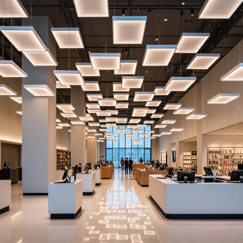
Uniform illumination in a commercial space begins with understanding the space itself. Measure room length, ceiling height, window positions, and surface colors. A dark carpet absorbs light, while a pale ceiling reflects it. Shelving, partitions, and suspended signs can create unexpected shadows.
Activities matter just as much. A reception desk needs comfortable facial visibility, while a retail aisle needs clear product labels. A meeting room requires balanced light on faces and tables. I once saw a plan that looked even on paper, but tall displays created dark patches near the floor. The mistake was trusting the layout instead of observing the room in use.
Tips: Map working zones first. Note daylight changes. Check light at eye level. Avoid bright spots on screens. Test before final installation. Use a light meter when possible, then compare readings across desks, walkways, and display areas. Small differences can affect comfort, concentration, and perceived safety. Keep glare under control by considering viewing angles, not only fixture positions.
A practical assessment should include morning, afternoon, and evening conditions. Record where sunlight enters and where shadows move. Select illumination levels according to the task, while keeping adjacent areas reasonably balanced. Uniformity does not mean every corner has identical brightness. It means people can move and work without sudden visual strain. Review the design with staff after installation. Their comments may reveal discomfort that measurements miss. Adjustments are sometimes necessary. Perfect results rarely appear on the first attempt.
Uniform illumination begins with a clear light-level calculation. Measure the room’s length and width, then multiply the area by the maintained illuminance target.
For example, a 12-by-8-meter office covers 96 square meters. At 500 lux, it needs 48,000 maintained lumens at the workplane. If the light-loss factor is 0.80, the installed output should approach 60,000 lumens. This allowance covers dirt, aging, and reduced surface reflectance.
Do not judge performance from average lux alone. Divide the lowest measured lux by the average lux to obtain the uniformity ratio. A result of 0.60 means the darkest point receives 60% of the average level. Many projects use 0.60 or higher, but the required value depends on the activity and local standard.
Measure on a grid across desks, aisles, and corners. Corners often expose weak planning. Glare can also make a bright room feel uncomfortable.
Fixture spacing depends on mounting height and the fixture’s spacing criterion. Multiply that criterion by the distance from the fixture to the working plane. For instance, a 1.2 criterion and a 2.5-meter mounting height suggest roughly 3 meters between fixtures.
Keep the perimeter spacing near half the interior spacing when possible. The first layout is rarely perfect. Reflections, beams, shelving, and dark ceilings can change the result.
I would verify the design with a scaled grid and one physical test area before ordering all fixtures.
Uniform illumination begins with suitable fixtures, carefully matched optics, and consistent color characteristics. The International Energy Agency reports that lighting uses about 15% of global electricity consumption. Efficient choices matter, but efficiency alone cannot prevent glare, shadows, or uneven brightness.
Select fixtures according to ceiling height, task position, and mounting layout. Wide-beam optics can reduce bright spots across open offices, while controlled beams suit aisles and display zones.
Target a practical uniformity ratio, such as 0.6 or higher for many working areas, then verify it with a calibrated light meter. Photometric software helps, but real measurements remain essential.
Small layout changes can alter results.
Color consistency deserves equal attention. Choose a suitable correlated color temperature, often 3000K to 4000K for commercial interiors, and specify a minimum color rendering index of 80 for general tasks.
The U.S. Department of Energy’s solid-state lighting research reports continue to emphasize efficacy, color quality, and controllability as connected performance priorities.
Avoid mixing fixtures with visibly different color points. It happens more often than expected.
A perfect grid is rarely achieved on the first pass, especially near shelves, partitions, and reflective floors.
Review glare, shadows, and visual comfort after installation, not only the calculated lux values.
Uniform illumination in commercial spaces does not mean making every surface equally bright. In my experience, flat lighting often creates a dull room with unnecessary glare. A better approach combines ambient, task, and accent layers. Ambient fixtures provide consistent background light across floors and walkways. Task lighting supports detailed work at desks, counters, or display areas. Accent lighting adds visual focus without disturbing overall comfort.
Start by mapping activities and daylight conditions throughout the space. A reception desk may need stronger vertical light, while a corridor needs steady, low-glare illumination. Place fixtures to reduce harsh shadows on faces and work surfaces. Use diffusers, indirect sources, and suitable beam angles where possible. Light sources with accurate color rendering can make products, materials, and skin tones appear more natural. Dimming controls also help staff adjust brightness during bright afternoons or quieter evening hours.
Test the design at eye level. Look for reflections on screens, dark corners, and bright spots on polished floors. A simple on-site measurement can reveal differences that a drawing misses. Still, calculations are not enough. One project may appear balanced on paper but feel uncomfortable after installation. That gap deserves attention. Review the space with users, then adjust fixture positions, output, or control settings. Layered lighting works best when technical planning and real human experience remain connected.
How to Achieve Uniform Illumination in Commercial Spaces?
Install the lighting system from the measured task, not the ceiling plan. Start with room dimensions, surface reflectance, mounting height, and furniture layout. EN 12464-1:2021 recommends checking maintained illuminance and uniformity for each visual task. In many offices, a uniformity ratio of 0.60 is a practical benchmark. Place luminaires in regular rows, but avoid copying a standard grid blindly. Desks, partitions, and shelves can create dark pockets. The first layout may still be wrong.
Measure after installation. Use a calibrated illuminance meter, and record readings across a defined floor grid. Take measurements at desk height, not only on the empty floor. Compare average lux, minimum lux, and uniformity against the design target. The Illuminating Engineering Society recommends documented field verification for critical visual environments. A single bright point can make the average look acceptable. It may still cause glare.
Fine-tune with aiming, spacing, output settings, and control scenes. Increase output only after checking glare and reflections on screens. The U.S. Department of Energy’s Solid-State Lighting research reports that many commercial LED products exceed 100 lumens per watt, but efficiency does not guarantee comfort. The International Energy Agency estimates lighting uses about 15% of global electricity. Reduce unnecessary output in overlit zones, then retest. Small adjustments matter. Human comfort is harder to measure than lux. That is where many designs need more reflection.
| Space / Zone | Area (m²) |
Recommended Average Illuminance (lux) |
Installed Fixtures | Mounting Height (m) |
Before Adjustment Average (lux) |
After Adjustment Average (lux) |
Uniformity U0 (Emin/Eavg) |
Measured Glare Rating (UGR) |
Fine-Tuning Action | Result |
|---|---|---|---|---|---|---|---|---|---|---|
| Open-Plan Office | 420 | 500 | 84 LED panels | 2.8 | 438 | 512 | 0.72 | 18 | Re-spaced perimeter fixtures and reduced output near windows. | Pass |
| Retail Sales Floor | 650 | 500 | 78 linear luminaires | 3.6 | 472 | 526 | 0.68 | 21 | Added cross-row aiming and balanced light levels at aisle ends. | Pass |
| Reception and Lobby | 110 | 300 | 18 recessed downlights | 3.2 | 286 | 318 | 0.76 | 19 | Adjusted downlight aiming and increased illumination at the reception desk. | Pass |
| Conference Room | 72 | 500 | 12 dimmable panels | 2.7 | 421 | 505 | 0.74 | 17 | Raised output by 10% and corrected uneven spacing along the presentation wall. | Pass |
| Corridor and Circulation | 185 | 100 | 31 recessed luminaires | 2.9 | 86 | 109 | 0.61 | 20 | Installed additional low-output units at corridor intersections and stair approaches. | Pass |
| Cafeteria and Break Area | 240 | 300 | 30 suspended luminaires | 2.5 | 263 | 307 | 0.70 | 19 | Aligned suspended fixtures with seating rows and reduced excessive brightness over circulation paths. | Pass |
| Warehouse Picking Area | 900 | 300 | 60 high-bay luminaires | 7.5 | 248 | 326 | 0.66 | 22 | Adjusted mounting orientation and increased output in rack-shadowed areas. | Review Glare |
| Customer Service Area | 95 | 500 | 16 LED panels | 2.8 | 455 | 518 | 0.73 | 18 | Balanced output between service counters and customer waiting zones. | Pass |
| Measurement basis: readings are taken on the working plane using a calibrated lux meter at a regular grid of points after the luminaires reach normal operating temperature. Average illuminance, uniformity, and glare should be checked against the project brief, applicable local requirements, and the intended visual tasks. | ||||||||||
Measure room length, ceiling height, window positions, and surface colors. Dark carpets absorb light, while pale ceilings reflect it.
Different tasks need different visibility. Reception areas need clear faces, while retail aisles need readable product labels.
Tall shelves, partitions, and signs can create unexpected shadows. Inspect lower walls and floor areas, not only open ceiling zones.
Check the space in the morning, afternoon, and evening. Sunlight moves, and shadow patterns change throughout the day.
Consider viewing angles, screen positions, and fixture placement. Avoid bright reflections on screens and glossy surfaces.
Wide beams work well across open offices. Controlled beams suit aisles, counters, and focused display areas.
Use a calibrated light meter when possible. Compare readings across desks, walkways, shelves, and display areas.
No. It means people can move and work without sudden visual strain. Small brightness differences may still be acceptable.
A color temperature near 3000K to 4000K often suits commercial interiors. A color rendering index of 80 or higher supports general tasks.
Calculations may miss discomfort caused by reflections, shadows, or viewing angles. Staff feedback can reveal problems. Adjustments are normal.
Achieving uniform illumination in commercial spaces begins with understanding the environment, the activities performed there, and the visual needs of occupants. Evaluating room dimensions, surface finishes, daylight availability, work tasks, and circulation paths helps establish suitable illumination targets. Designers should then calculate light levels, uniformity ratios, and fixture spacing to reduce dark areas, glare, and distracting contrasts. This process also explains why is uniform illumination important in commercial spaces: consistent lighting supports visibility, comfort, safety, productivity, and a more welcoming customer experience.
The next step is selecting fixtures, optics, and color characteristics that match the space’s function and visual atmosphere. A layered approach combining general, task, accent, and architectural lighting can create balanced environments without relying on a single lighting source. After installation, the system should be measured in actual conditions and fine-tuned by adjusting fixture positions, output levels, controls, or aiming angles. Regular evaluation ensures that the finished design performs consistently as the space, furnishings, or activities change.

Bluu Light